Bright Or Neutral: Picking A Swimsuit Color

Bright Or Neutral: Picking A Swimsuit Color

Choose a neutral swimsuit when versatility matters most, and choose a bright shade when color is the point. For the strongest all-purpose option, neutral wins because it stays quieter while the shape and setting can do more of the work.

Bright color changes the first impression. Blue and green can

Choose the quiet default

Choose a neutral swimsuit when versatility matters most, and choose a bright shade when color is the point. For the strongest all-purpose option, neutral wins because it stays quieter while the shape and setting can do more of the work.

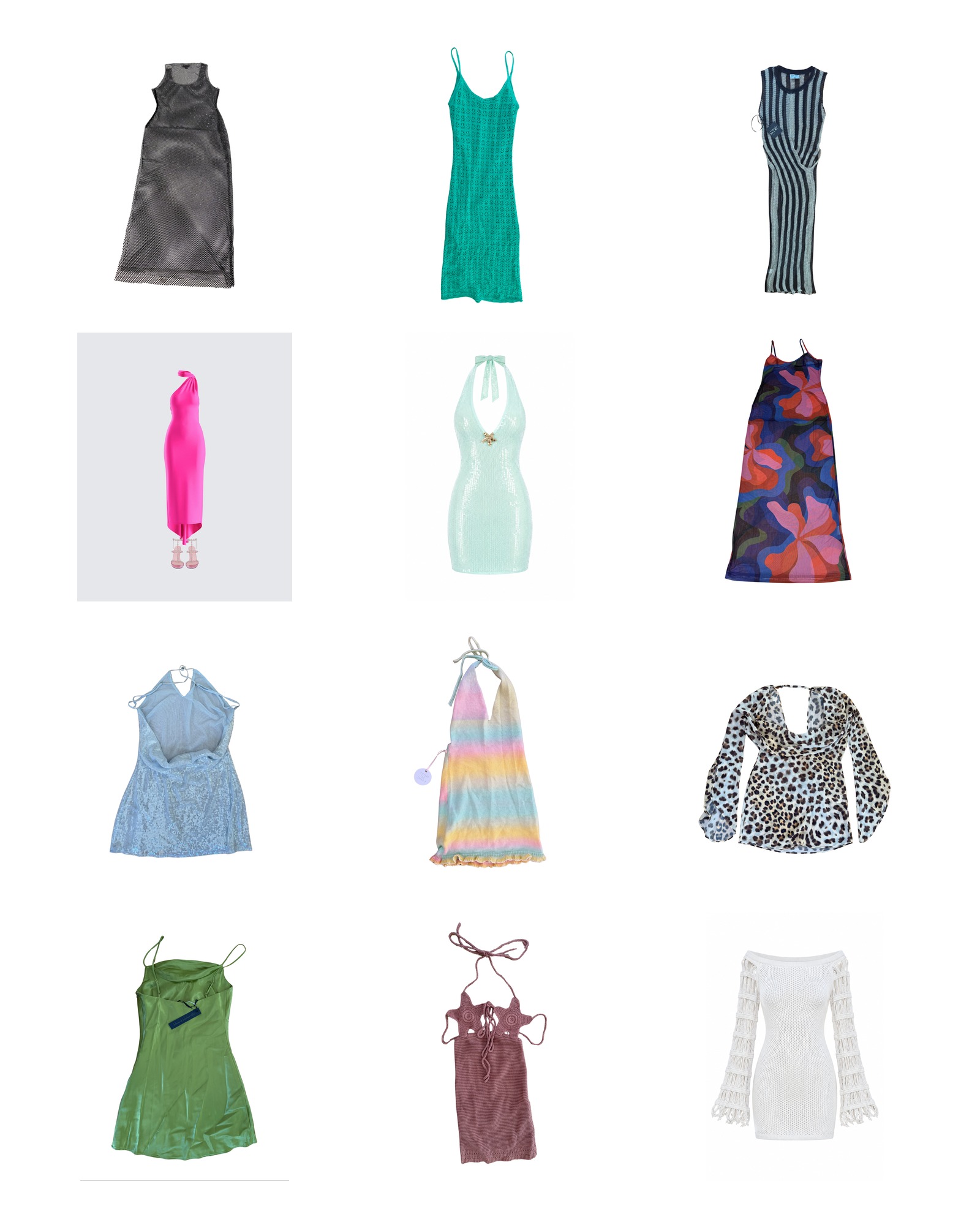
Bright color changes the first impression. Blue and green can feel lively, especially when the suit is meant to be the visible center of the outfit. Neutral shades create more room for a cover-up, jewelry, or a strong tan line to become part of the look without adding another competing note. The choice also depends on how often the suit will be worn. A color you love for one trip may feel specific, while black, ivory, or a softer pale shade can move between different plans with less effort. Ana de Bretaña / Deep Blue is a confident choice when the color should lead. Eleanor / Silky Black takes the opposite route, giving the suit a quieter base. Both approaches work, but a neutral is the safer recommendation when there is no single occasion in mind. Start there, then go brighter when you want the swimsuit itself to set the tone.

Blue and green swim

Blue and green swim gives the brightest side of the decision a clear direction. These colors are not interchangeable, so choose based on the mood you want rather than treating blue and green as one general category. Deeper blue feels grounded, while pale blue or green reads lighter.

Color placement matters as much as color family. A bright suit can act as the focal point under a neutral cover-up, or it can be part of a stronger head-to-toe palette. If the shade is already vivid, repeat it only when the rest of the outfit is restrained. If the color is softer, a contrasting accessory can give it definition without overwhelming it. Check the full plan before choosing: a swimsuit that works alone may need a different balance when layered.

Lilias / Tea Green makes a case for a gentle green, while Inika / Pastel Blue keeps the effect cool and light. Neither needs a complicated styling formula. Pick one supporting tone, leave space around the color, and let the suit remain legible as the center of the look. Bright does not have to mean loud, but it should be chosen on purpose.

Our honest take

Neutral is the better default, while bright color is the better statement. That distinction keeps the choice practical: pick a quiet shade when repeat wear matters, and pick blue or green when the swimsuit should establish the mood.

If you take one thing away, make it this: decide whether the color should support the rest of the outfit or lead it. We would choose neutral for flexibility, then reach for a bright shade when the occasion calls for more energy. Neither route is automatically more flattering or more interesting. The right choice is the one that matches how much attention the suit needs to carry. A quiet color can look intentional, not boring, and a vivid one can feel focused rather than loud when everything around it gives the shade room.