Monogrammed jewellery dates when the lettering does the shouting. The typefaces, scales and placements that keep an initial looking current.
Monogrammed Jewelry That Does Not Look Dated
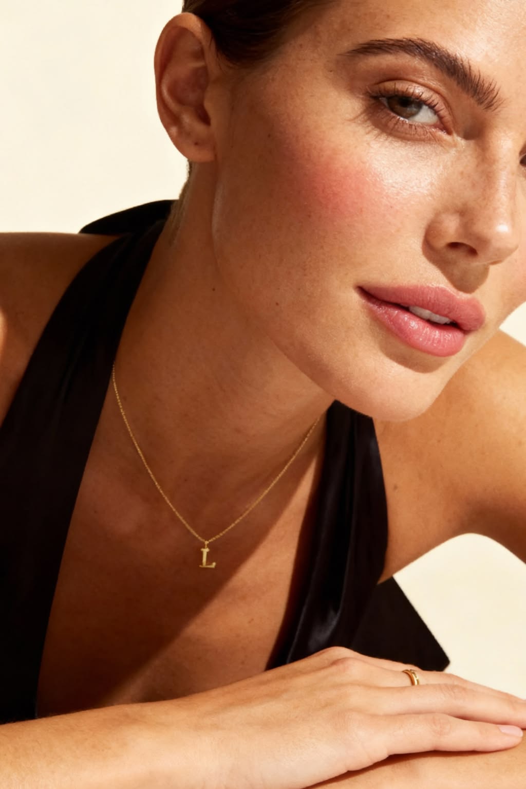
The typeface dates the piece, not the idea
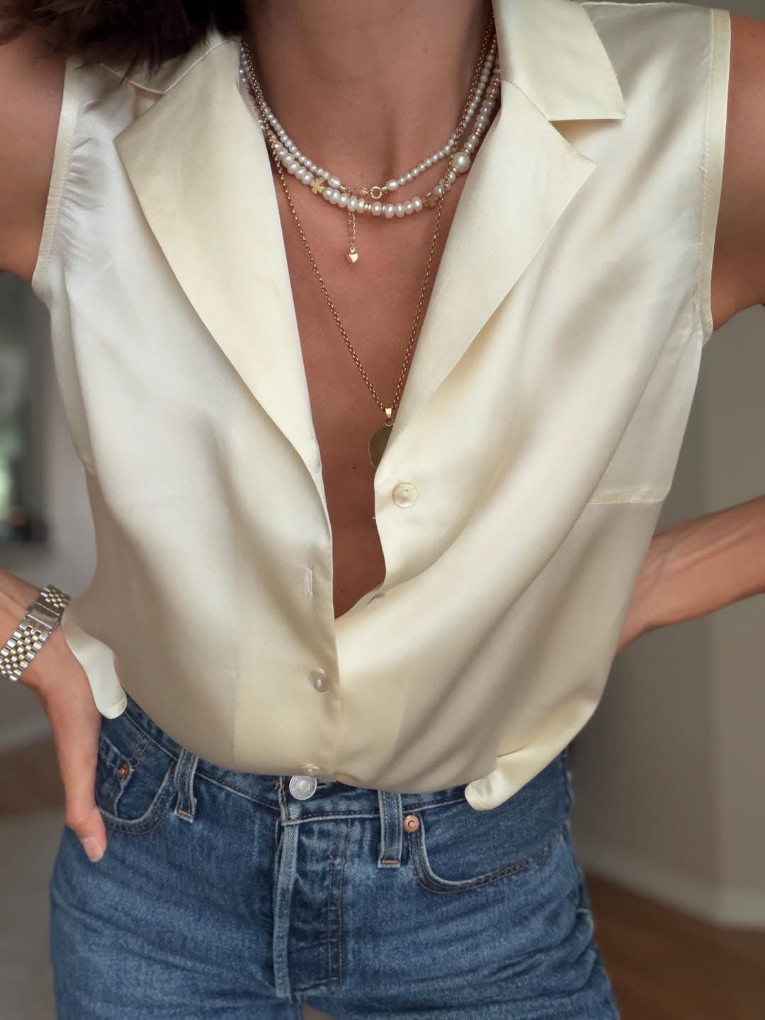
An initial necklace does not look dated because it has a letter on it. It looks dated because of the letter's typeface, and typefaces belong very firmly to decades. Heavy script with a long tail, block capitals with a shadow, bubble letters with a high shine, all of these read as a specific era the moment you see them. What survives is lettering with no personality of its own. A plain serif, a thin sans, or a letter cut in outline rather than solid. The second variable is scale. A large initial is a statement about the letter. A small one is a detail that happens to be a letter, and the small version is what people still wear ten years later. The third is finish. High polish amplifies the lettering. A brushed or matte finish lets it recede. Put those together and the durable version of this piece is small, plainly lettered and softly finished, which is not the version most brands photograph.
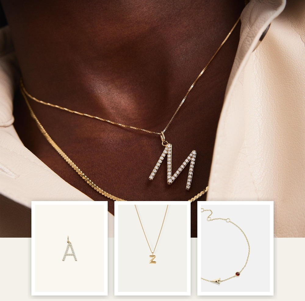
Letters and initials

Lab Grown Diamond Pavé Station Letter Necklace
Aurate New York
$698

Lab Grown Diamond Script Letter Pendant
Aurate New York
$678

Gold Station Letter Necklace
Aurate New York
$578

Lab Grown Diamond Oversized Letter Charm
Mejuri
$528

Diamond Letter Bracelet
Mejuri
$448

14K Gold Bubble Letter Necklace - Z
Jenny Bird
$440

Letter Necklace
Mejuri
$398

Initial Custom Medallion Necklace
BaubleBar
$158
Whose initial, and where to put it
There is a quiet question underneath this category, which is whose initial you are wearing. Your own reads as self-possession. A partner's reads as a statement with a shelf life. A child's or a parent's reads as neither and is the most common reason people wear this category for decades. Worth deciding before you buy, because it changes what you can bear to wear when things change. On placement, an initial on a short chain sits in the hollow of the throat and is read by everyone who talks to you. On a longer chain it disappears under a neckline and becomes private, which many people prefer. An initial on a bracelet or a signet is quieter again. And multiple initials on one chain, spaced rather than clustered, is the arrangement that has aged best. Clustered initials tangle and read as a monogram in the heraldic sense, which is a much stronger look than most people want.


Our honest take
We would buy the small one. Almost every regret in this category is a scale problem, and nobody has ever complained that their initial was too discreet. Buy it in solid metal too, because a plated letter wears at the edges of the lettering first and a worn letter looks cheap in a way a worn plain chain does not. We would avoid script entirely unless you love it now and are prepared to stop wearing it, and we would avoid anything where the letter is set with stones, which is the fastest route to looking like a gift someone chose for you. If you are buying this for somebody else, the safest version is a plain letter on a fine chain in the metal they already wear. If you take one thing away, go a size down from the one that looks right in the photograph.
Shop brands in this edit



Next read
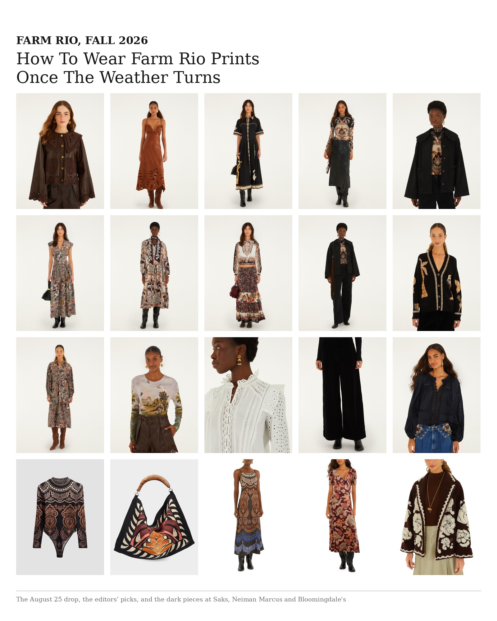
How To Wear Farm Rio Prints Once The Weather Turns
Farm Rio's fall drop trades tropical brights for chocolate leather, black denim and dark florals. Here is how to wear the prints past September, plus the dark pieces our editors are buying at Saks, Neiman Marcus and Bloomingdale's.
Read Editorial
Necklace Or Studs: Which To Buy First
Choosing necklaces first is usually the better buy when one piece should change several outfits, but choice depends on your neckline and daily habits. Start with placement