Dressing entirely in one neutral has stopped reading as taste because everyone is doing it, and flat monochrome also hides the thing worth showing, which is shape. Below, three tonal families, dark, warm and light, and how to make them work against each other.
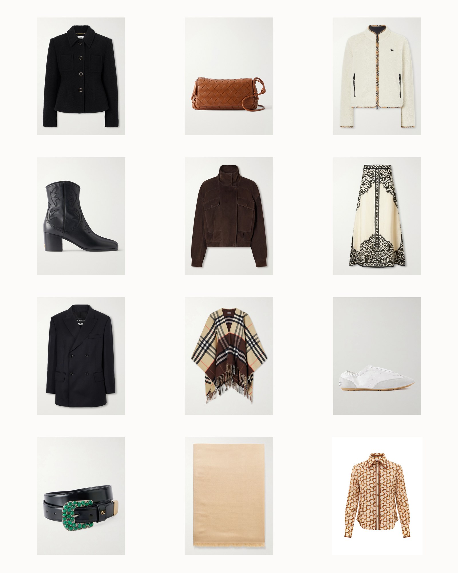
Why Neutrals Need Contrast
Something has happened to neutrals over the last few years and I cannot stop noticing it. Bone, cream, black, camel. It photographs beautifully, it is easy to shop, and it now looks like a uniform because it is one.
I am not criticising anyone wearing it. I own most of it. But it is worth being clear-eyed about what changed. That palette originally read as taste because it was restrained while everything around it was loud. Now that it is the default, restraint is not a signal any more. It is the baseline.
The other cost is less obvious. Dressing head to toe in one tone flattens you. There is nothing for the eye to travel along, so the outfit becomes a single quiet block and the shape of what you are wearing disappears.
The fix is not colour. The fix is contrast within neutrals, which is a different and much more useful thing.
The Base: Black, Navy And Grey

Wool-blend bouclé jacket
Chloé
$2,350

Zimmy 40 embroidered leather ankle boots
Valentino Garavani
$1,750

Pinstriped wool-blend double-breasted blazer
Junya Watanabe
$1,305

VLogo embellished leather belt
Valentino Garavani
$980

Valiant Merino Lace Sweater
Zimmermann
$775

Savai cotton-gauze dress
Ruohan
$550

Lace Wool Stole
Zimmermann
$395

Nala Scoop Neck Top
A.L.C.
$100
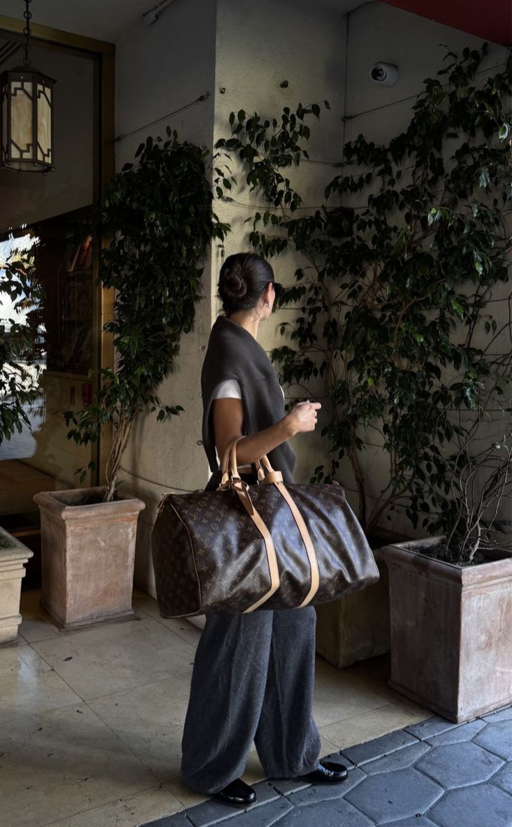
Think about it as temperature rather than as shade. Neutrals are either cool or warm, and putting a cool one against a warm one is what creates a visible edge without introducing a colour that shouts.
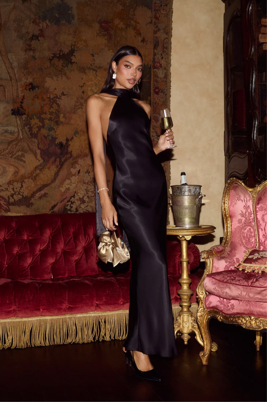
The cool group is black, navy, charcoal and true grey. These do structure. They read decisive and they define an outline, which is why tailoring lives here.
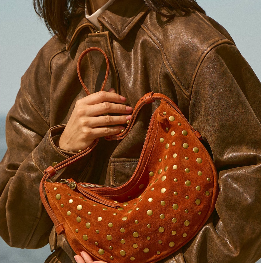
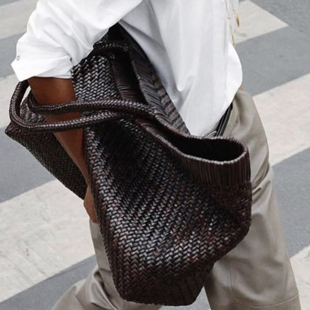
The warm group is camel, brown, chocolate, biscuit and beige. These do softness and depth, and they are the group most people underuse. A brown against a navy is one of the most interesting things you can do with two supposedly boring garments, and it looks nothing like the beige uniform.
The light group is cream, bone, ecru and white, and its job is to lift and to break up mass. A cream layer at the top of an outfit does what a light source does in a photograph.
Two of those groups in one outfit is usually enough. Three is a considered thing, not an accident.
The Warm Middle: Camel, Brown And Beige

Notturno Intrecciato leather shoulder bag
Bottega Veneta
$2,600

Quincy cropped paneled suede bomber
Nour Hammour
$1,885

Fringed checked cashmere and wool-blend cape
Burberry
$1,450

Karakorum cashmere and silk-blend scarf
Brunello Cucinelli
$1,150

Marvi Sandal 75
Zimmermann
$895

Easton suede ankle boots
A.Emery
$620

Fine Knit High Neck Top
Zimmermann
$450

Hadley Cotton Rib Tank
A.L.C.
$98
Why this matters more than colour: neutrals let the eye follow the shape rather than stopping on a bright patch.
A red garment becomes the subject of the outfit, always. Put a chocolate trouser under a cream knit and the eye instead travels the line where they meet, and what it reads is your proportion. That is why tailoring photographs so well in these combinations, and why they end up being the looks people remember without being able to say why.
Practical notes. The join is where this works or fails, so put your contrast at a point you want noticed, usually the waist or the shoulder. Match the finish, not just the tone: a matte wool trouser and a shiny satin skirt in the same beige will look like an accident, while two different browns in the same dry finish will look intentional.
And check your neutrals in daylight together, physically. Cream and bone are friends. Cream and optic white are not, and a screen will never tell you that.
The Light Note: Cream, Bone And White

Check-trimmed wool-blend plush jacket
Burberry
$1,550

Loose Horizon printed linen maxi skirt
Johanna Ortiz
$1,150

Lewis suede-trimmed leather sneakers
Saint Laurent
$830

Mila Linen Midi Shirtdress
A.L.C.
$525

Danae cropped cable-knit cashmere cardigan
Dôen
$370

Foam Asymmetric Wrap Belt
Zimmermann
$295

Dean Racerback Rib Knit Tank
A.L.C.
$65

Lovisa cashmere sweater
Lisa Yang
$528
Our honest take
We are a bit tired of the all-cream outfit and we say that with affection, having recommended it many times. It is not that it looks bad. It is that it no longer says anything.
What we would skip: buying a fourth garment in the tone you already own most of. Go and count. Most people are three cream tops deep and have nothing warm to put against them, which is exactly why the wardrobe feels flat.
What we would buy: one genuinely warm piece, brown or camel, in a heavy dry fabric. It will do more for the clothes you already own than anything else at the same price, because it unlocks every dark and every light thing in your closet.
We would also gently say that the accessories in this edit are doing real work. A brown suede boot under a navy trouser is the cheapest version of this whole idea.
If you take one thing away: stop dressing in one tone and start dressing in two temperatures. Pick something cool and something warm and let the line between them be the point. If you want to keep browsing, I also put together Yeezy Slides.