Satin vs eggshell paint is really a question about light: how much the wall reflects, how much it forgives and how easily it wipes clean. Here is how I would choose, and how the same idea carries into the objects and bedding in a room.
Satin vs Eggshell Paint, and What the Sheen Changes
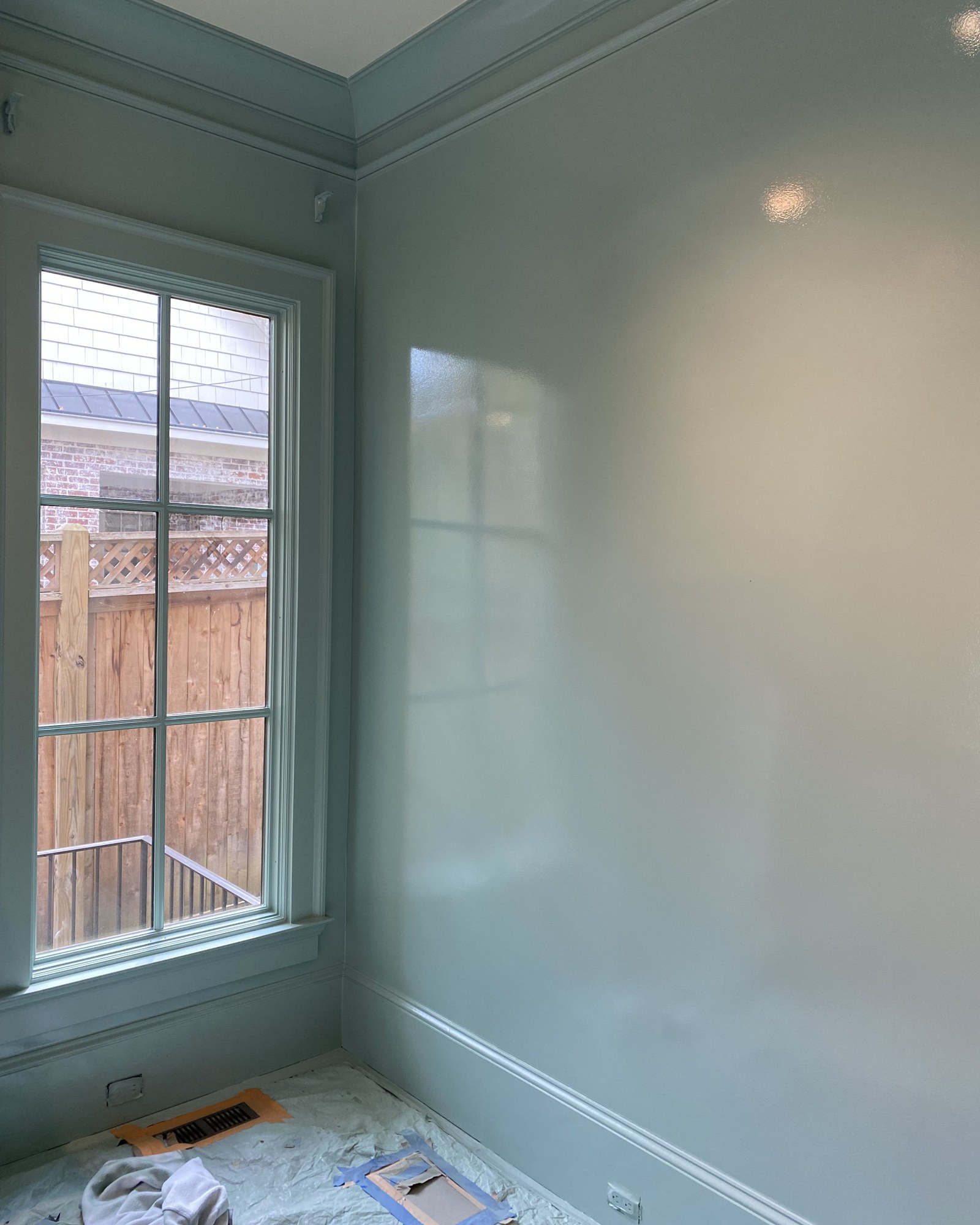
Stand in a paint aisle long enough and the sheen names start to sound like a wine list. Flat, matte, eggshell, satin, semi-gloss, gloss. They are the same color on the chip, and they can look like completely different colors on your wall, because sheen changes how much light bounces back at you.
The satin vs eggshell paint question is the one most people actually face, because these are the two sheens in the middle. Eggshell has a low, soft glow, named for exactly what it sounds like, the surface of an egg. It is gentle on walls, it hides small dents and patches well, and it reads as calm, which is why it is the usual choice for living rooms, bedrooms and dining rooms. Satin is a step shinier. It has a pearly sheen, it stands up better to scrubbing and moisture, and it is the common pick for kitchens, bathrooms, hallways, kids' rooms and trim. The catch is that the extra shine shows every bump and roller mark on an imperfect wall.
So my rule is simple. Eggshell where you relax, satin where you touch, splash or wipe. If your walls are old and a bit wavy, lean toward eggshell even in busier rooms.
None of the shops here sell paint, so rather than pretend otherwise, the grids below play with the same idea in objects. The first is pieces with a satin sheen: Anthropologie's floral glazed earthenware side table and embossed porcelain tray, McGee & Co.'s Iverson glazed pot, Magnolia enameled tray and glazed berry bowls, and two Burmese lacquer boxes from Cabana.
Glazed and lacquered pieces with a satin sheen


Eggshell, but make it clay
If satin is the pearly, wipeable sheen, eggshell is closer to the surface of unglazed pottery: soft, a little chalky, with light that seems to sink in rather than bounce. That is why I like pairing eggshell walls with matte objects. Everything in the room reads calm and a bit sun-faded, the way a room in a Mediterranean house does in the late afternoon.
Terracotta is the easiest way to get there. McGee & Co.'s ornate terracotta planter and their pedestal planter look old the moment you put a plant in them. Anthropologie's Raven vase is dark, almost charcoal clay, and their sculptural terracotta vase has an asymmetric shape that works on its own, no flowers needed. Lulu and Georgia's Rialto pitcher is lovely for a few branches on a dining table, and the Jaro planter by Meso has a softer, rounder form.
For contrast in texture rather than sheen, Lulu and Georgia's travertine bowl by Four Hands has tiny natural pits in the stone that catch shadow, and McGee & Co.'s Enzo concrete planter is the coolest in tone, good in a room painted a warm white.
A small test worth doing before you pick a sheen: hold a matte object and a glossy one against your paint sample in the room you are painting, morning and evening. You will see very quickly which kind of surface the room wants more of, and which sheen will balance it. A room full of glossy things usually wants eggshell walls. A room full of matte things can handle a little satin.
Matte terracotta and stone with an eggshell softness


Sateen, the satin finish of the bedroom
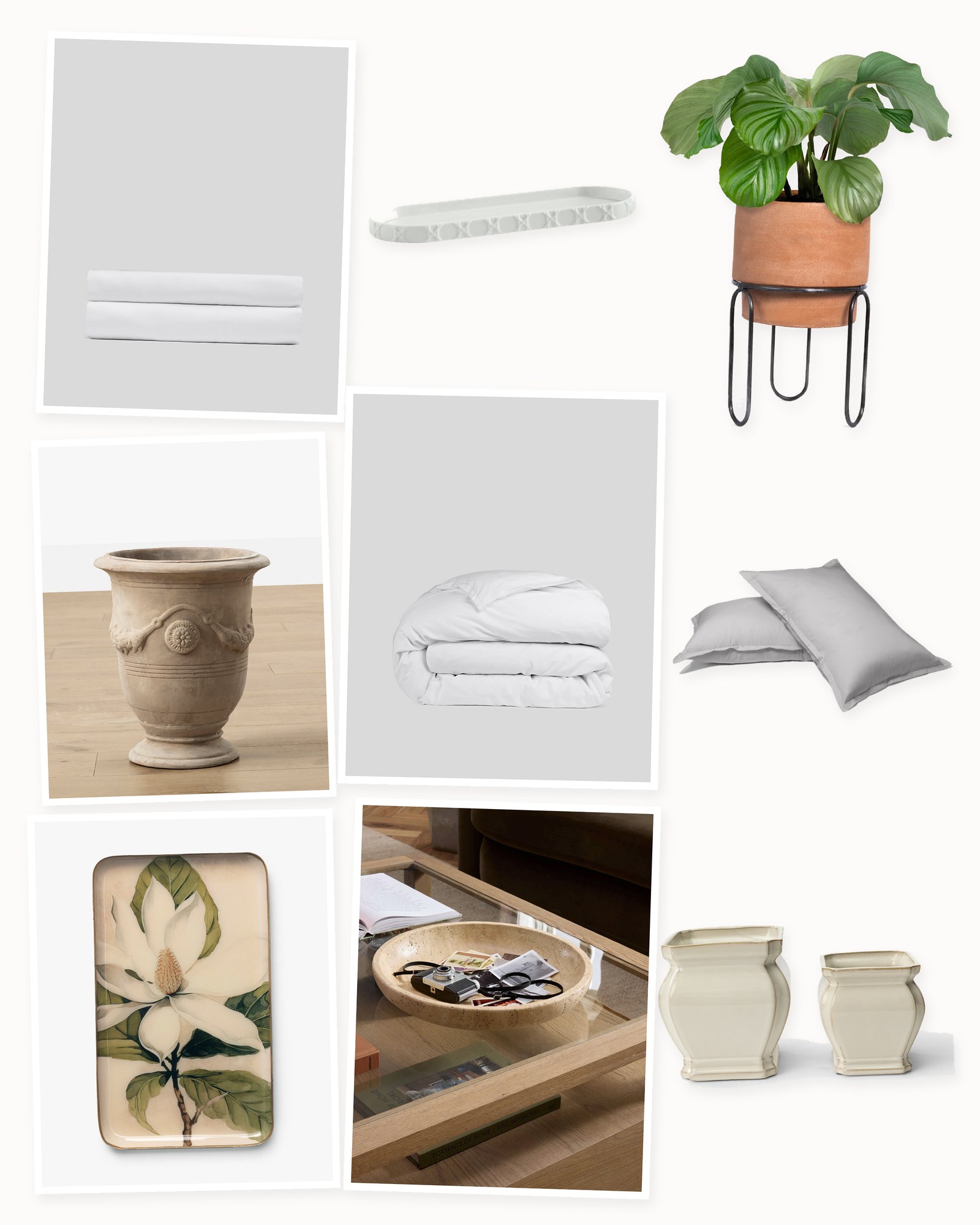
The same sheen question shows up in bedding, where it is called sateen versus percale. Sateen is a weave, not a fiber, and it floats more threads on the surface, which gives cotton a soft luster and a smooth, heavier feel. Percale is matte and crisp. If you like a bed that glows a little in lamplight and drapes close to the body, sateen is your satin.
Parachute's sateen duvet cover and fitted sheet in white are the purist's choice, smooth and simple. Annie Selke's essential sateen pillowcases and Casper's sateen sham are easy ways to try the finish without replacing a whole bed. Lulu and Georgia's Ashton sham is cotton sateen with a clean, tailored edge. Kassatex's Ricamo set adds a thin embroidered border, which looks elegant on a white bed. Anthropologie's organic cotton spa sateen duvet has a ruffle, and Urban Outfitters' Gemma duvet is printed with florals, proof that sateen does not have to be formal.
Sateen does have a trade-off. It sleeps a little warmer than percale and can pill if you wash it hot and dry it on high. Wash cool, dry low, and pull it out while slightly damp for the smoothest finish.
What I would skip: satin paint and sateen bedding and glossy lacquer all in one bedroom. Too much sheen in a small room feels restless. Pick one surface to glow and let the rest stay soft.
Sateen sheets, the satin finish of the bedroom


Our honest take
Sheen is one of those decisions that seems tiny until you see the wall finished. The color is the same, but the room feels completely different, and that is true of objects and fabric too.
If you take one thing away, let it be this: choose eggshell for rooms where you relax and satin for rooms you wipe down, then balance the room with the opposite finish in your objects. Matte clay next to a satin wall, a lacquer box against an eggshell one. Paint a large sample board in both sheens, tape them up side by side, and look at them at night with the lamps on. That is when the difference is clearest, and it is how you will actually live with it.