Most unworn prints failed on scale or contrast, not on the motif. Here is how to judge a floral, a geometric and an animal print before you buy, and how to wear one so it looks deliberate rather than costumed.
Floral, Geometric or Animal: How to Choose a Print You Will Actually Wear
Judge the scale and the contrast, not the motif
The print people abandon is rarely the wrong motif. It is almost always the wrong scale or the wrong contrast, and both are visible in a photograph if you know to look.
Scale is the size of a single repeat. A small-scale print reads almost as a texture from across a room, which makes it quiet, easy to wear and easy to repeat. A large-scale print reads as a graphic statement, and where the repeat happens to land on the body changes the whole garment. A big motif sitting across the bust looks very different from the same motif at the hip.
Contrast is the distance between the lightest and darkest colour in the print. High contrast, such as black on white, commands attention and holds its own from a distance. Low contrast, such as tonal blues, softens everything and flatters more easily.
If you own prints you never reach for, look at them together. They will usually share a scale or a contrast level that does not suit you.
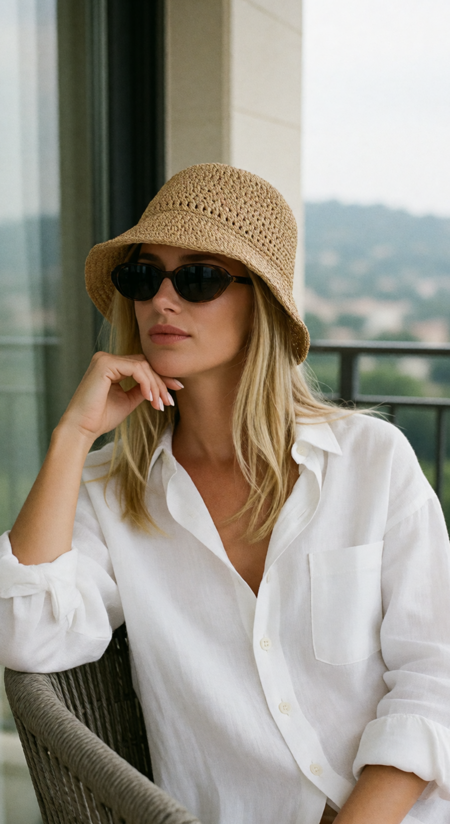
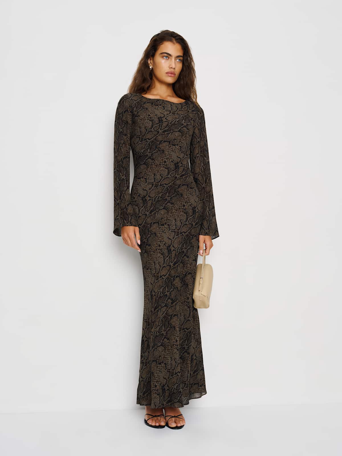
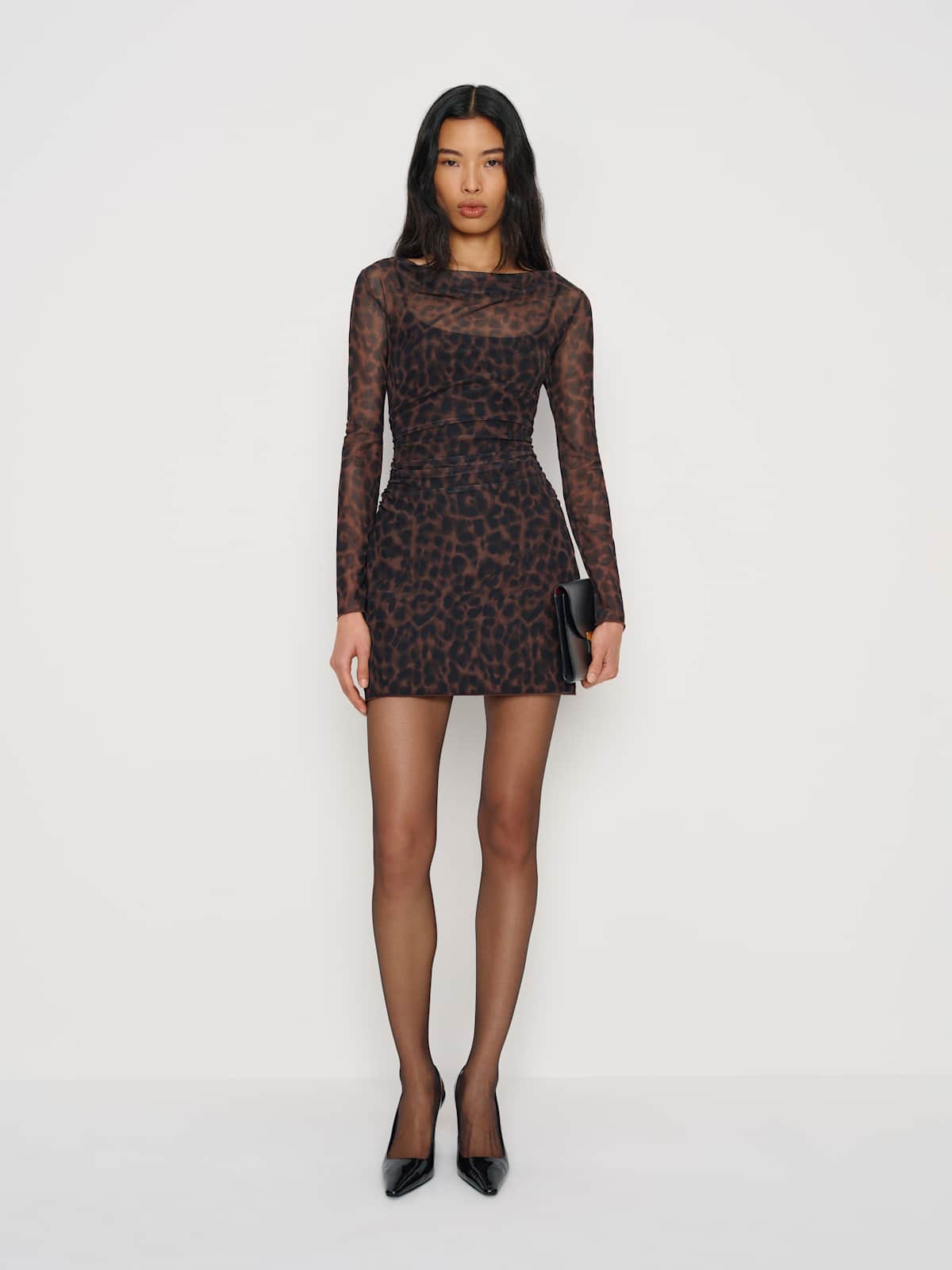
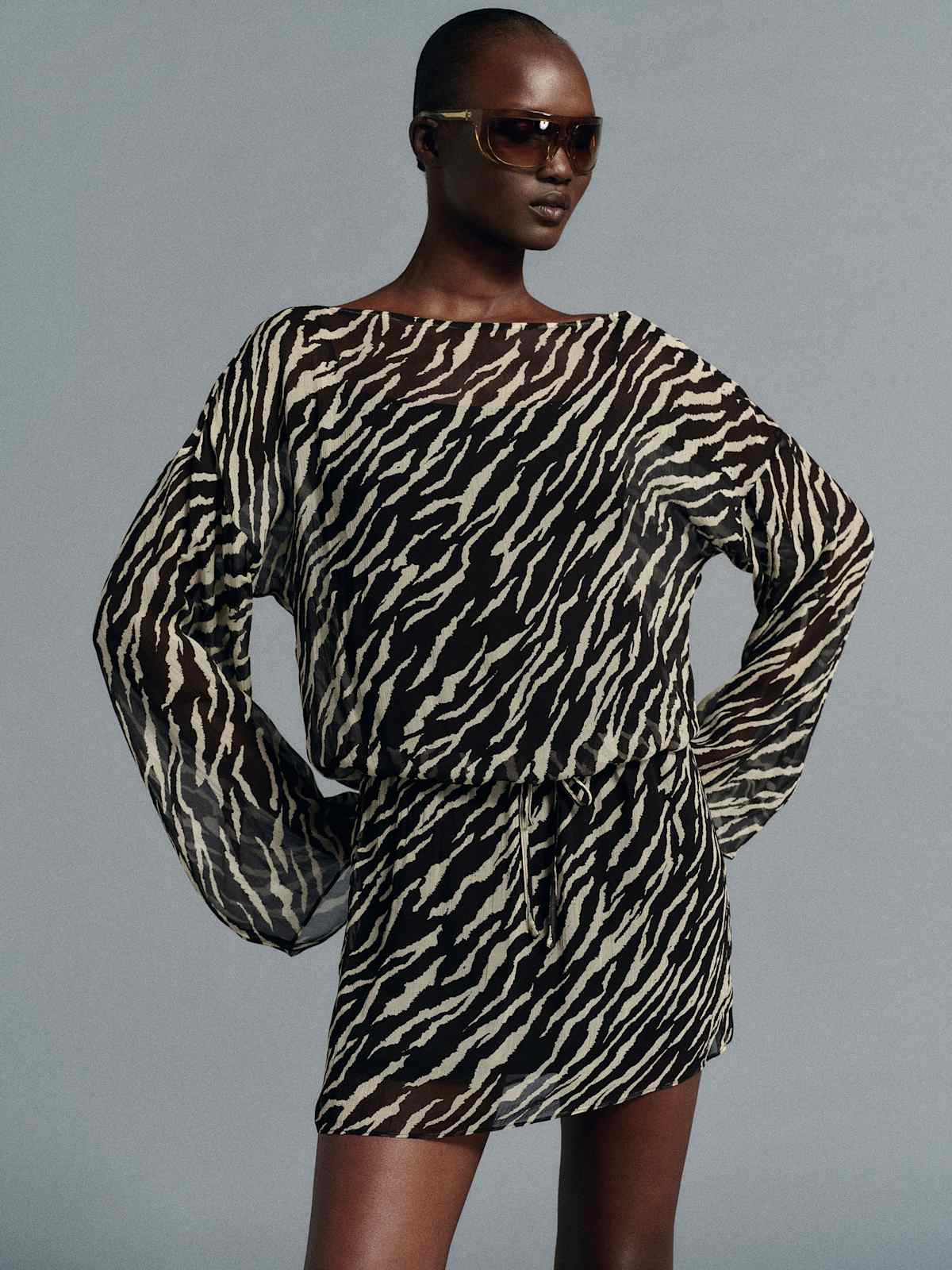
Animal print, worn quietly


What separates the three families
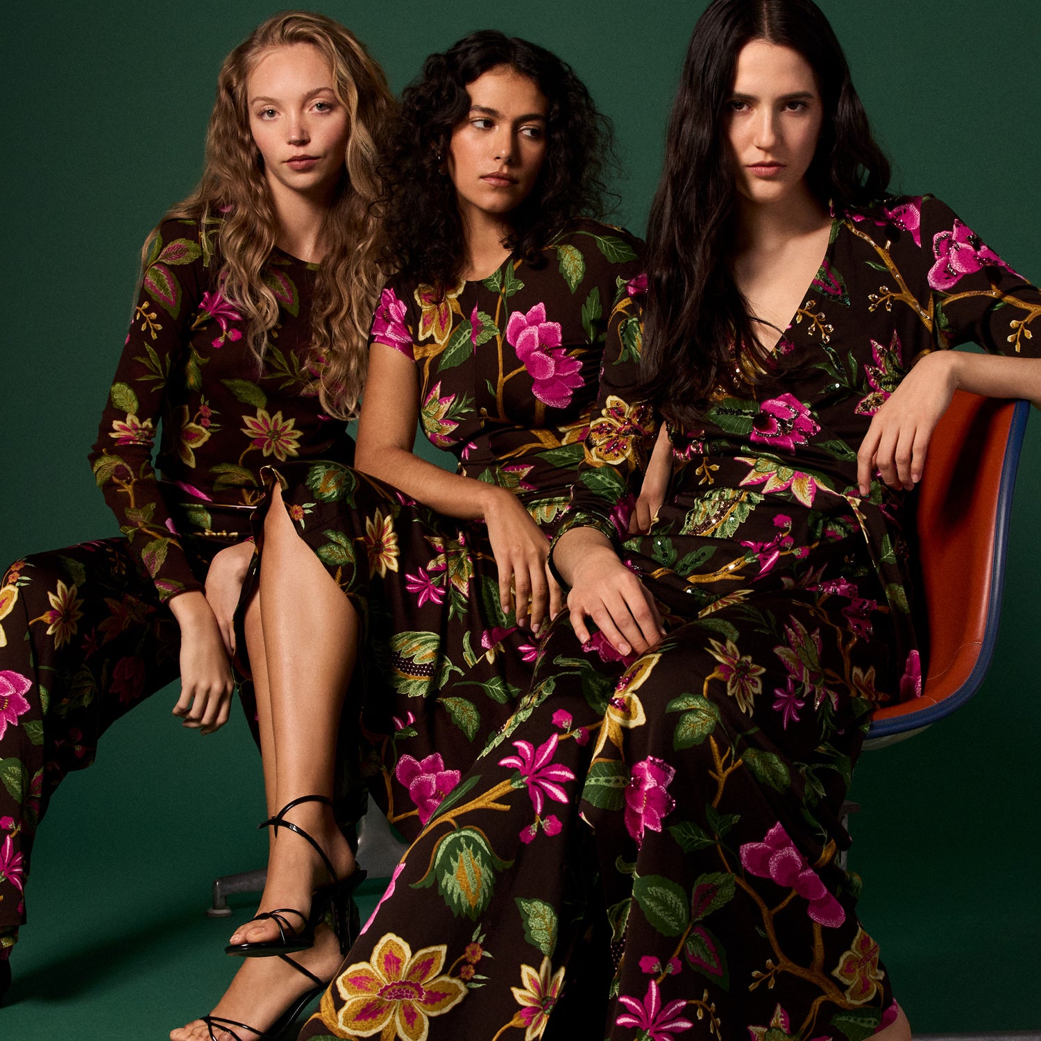
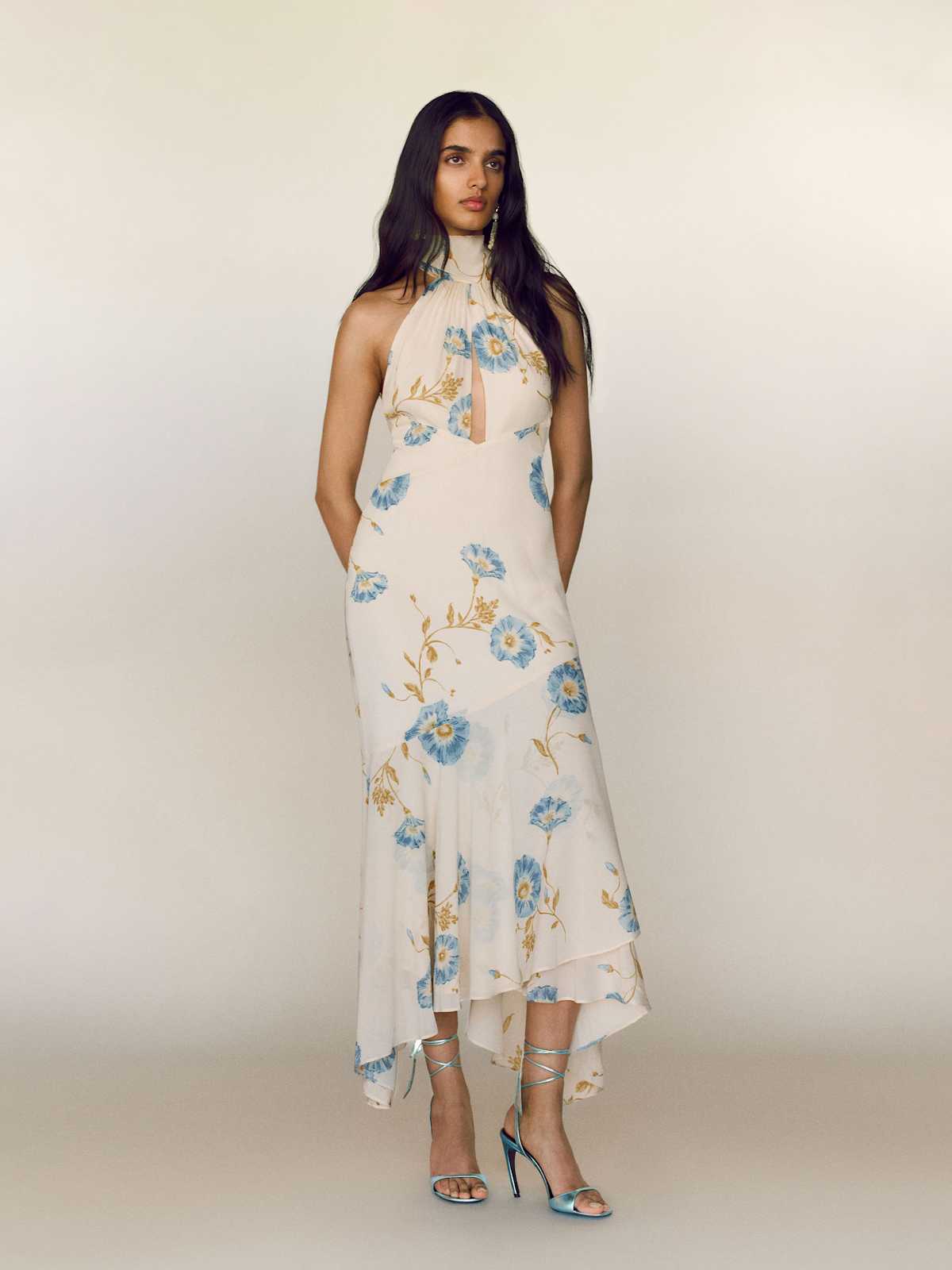
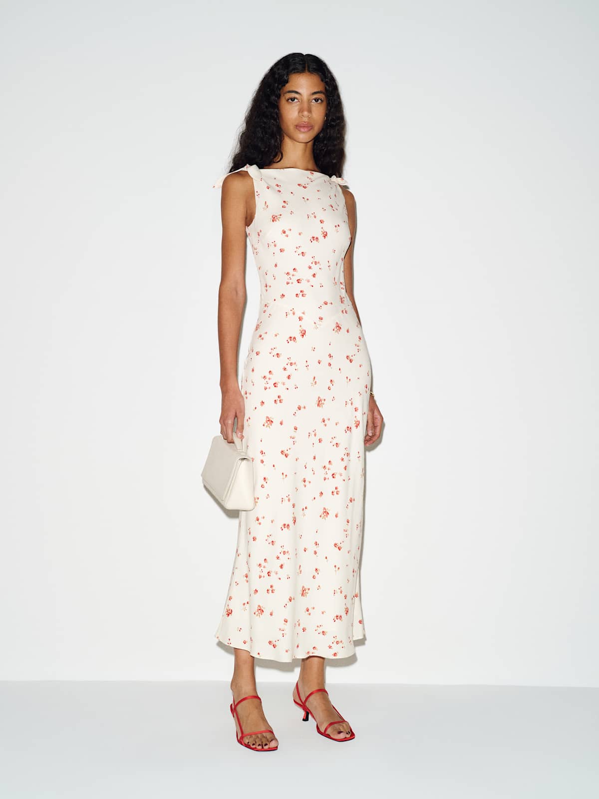
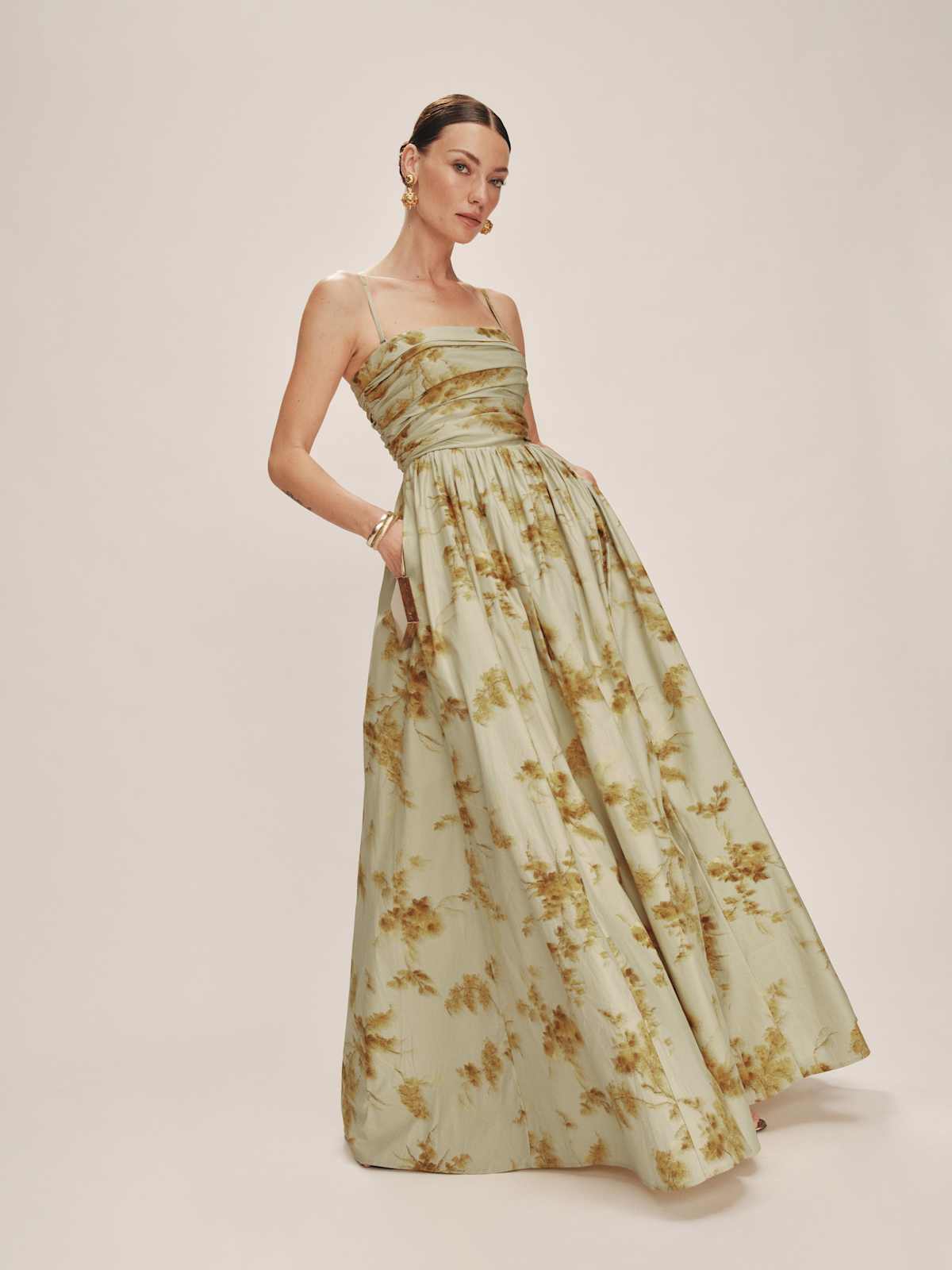
A floral is the most forgiving because the shapes are irregular, which disguises seams and hides where a repeat begins. Small-scale florals behave like solids and go anywhere. Large-scale florals need a simple silhouette so the print and the cut are not competing.
A geometric is the most structural. Checks, stripes and repeating chain links follow the grid of the fabric, so they show the body's lines and the garment's construction very clearly. That precision is the appeal, and it is also the risk, because a geometric will reveal a poorly matched seam that a floral would hide. Look at how the pattern meets at the side seams and the centre front.
An animal print behaves like a neutral more than people expect. Leopard, snake and zebra sit in a narrow band of browns, creams and blacks, which is why they combine easily with the rest of a wardrobe. Treat them as a base colour rather than a statement and they become the most useful print you own.
Geometric prints: checks, stripes and chain links

Prita Silk Georgette Shirt Dress
Diane Von Furstenberg
$728

Harley Scarf Dress
Diane Von Furstenberg
$898

New Abigail Wrap Maxi Dress
Diane Von Furstenberg
$898

Karlie Jacket
Diane Von Furstenberg
$748

Nora Dress
Diane Von Furstenberg
$728

Erica Dress
Diane Von Furstenberg
$498

Sheska Dress
Diane Von Furstenberg
$428

Kristen Wrap Dress
Diane Von Furstenberg
$548
How to wear one so it looks deliberate
Give the print the loudest job and let everything else be quiet. One printed piece with solid shoes, a solid bag and simple jewellery always reads as a decision. The instinct to match an accessory to a colour in the print is what makes an outfit look costumed.
For mixing two prints, the reliable rule is to keep the colour family shared and the scales different. A small ditsy floral with a wide stripe in the same palette works. Two large prints at the same scale fight.
Separates are the easiest way to start. A printed skirt with a plain knit, or a printed blouse with tailored trousers, gives you the print in a smaller dose and lets you judge whether you actually reach for it.
For anything with a strong repeat, check the fit at the bust and the waist carefully. A print shows pulling and gaping far more clearly than a solid does, which is a good argument for buying prints in fabrics that stretch.
Florals, from small-scale to statement


Our honest take
Print is where most people overthink and then overcompensate. Matching a shoe or a bag to a colour inside the print is the most common mistake, and it is what makes an outfit look styled by a shop rather than by the person wearing it. Animal print behaves like a neutral if you treat it as one. Geometrics are the most forgiving of the three, because a check or a stripe gives the eye a line to follow. Florals are the easiest to get wrong at large scale.
If you take one thing away: to keep a bold print from wearing you, keep everything else solid and quiet, and choose a simple silhouette so the cut and the print are not competing.
Shop brands in this edit


Next read
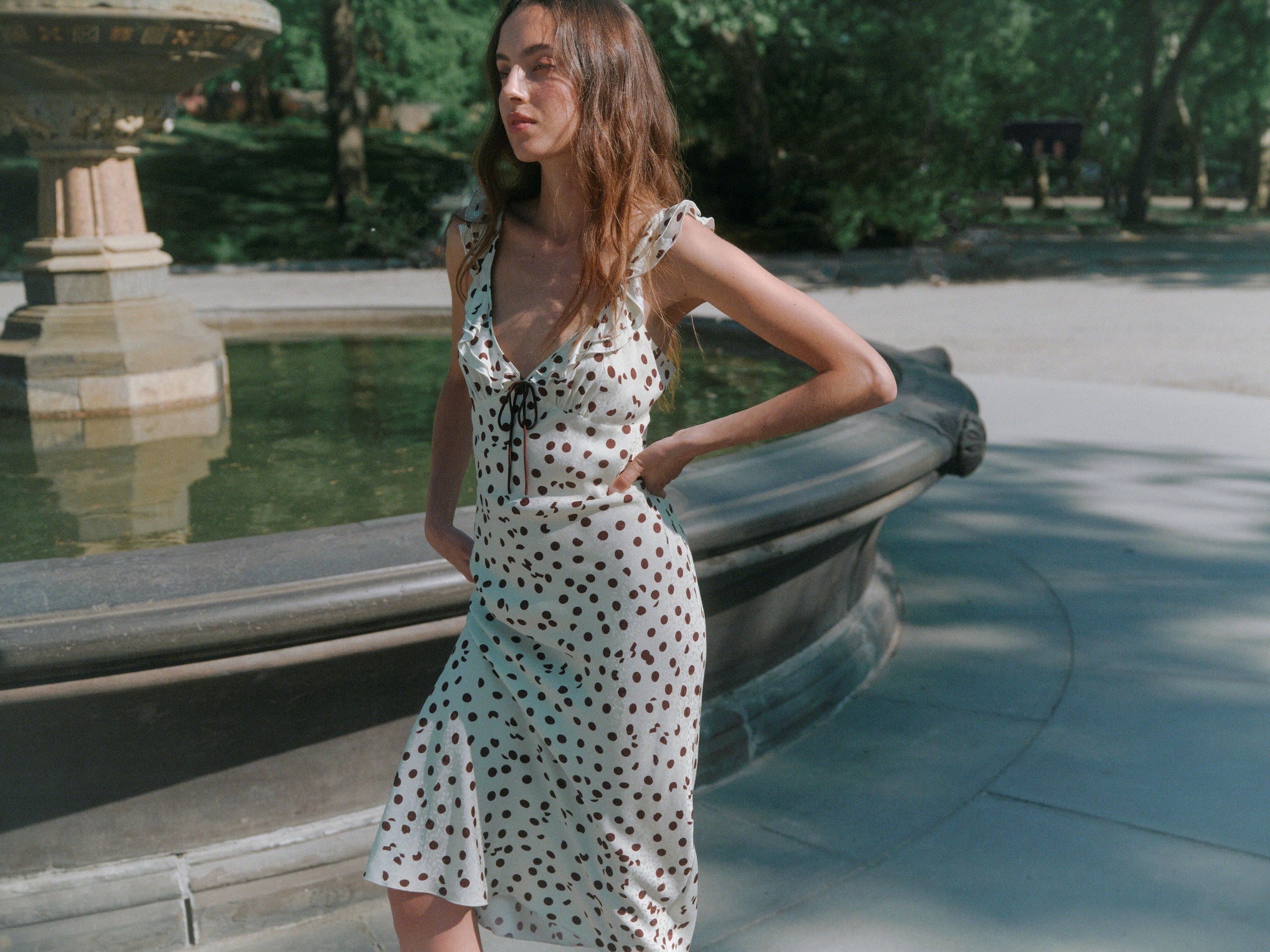
Mini, Midi or Maxi: How to Choose a Dress Length
Mini sits above the knee, midi falls between the knee and the ankle, and maxi runs to the floor. The right one depends on the occasion, your proportions and the shoes you plan to wear. Here is how to decide before you order three lengths and return two.
Read Editorial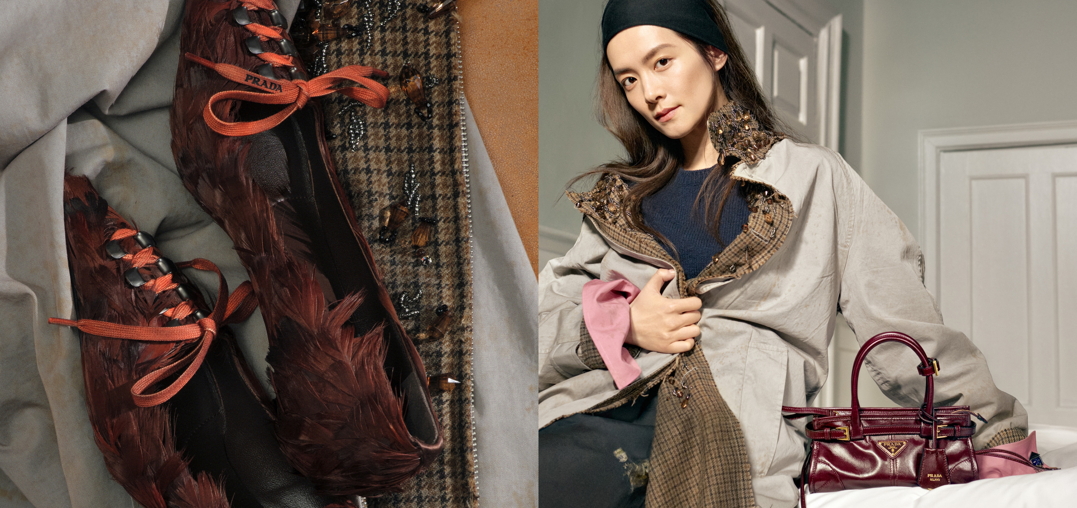
Cardigan or Pullover: How to Choose the Knit You Will Reach For
Cardigans and pullovers behave differently in real life, and fibre matters more than either. How to judge cashmere, ply and fit, with Prada and Miu Miu knitwear for each.